

Google is preparing to give Android Auto its most significant visual overhaul in years, and the first visible sign of that change is now appearing on devices. A newly redesigned icon for Android Auto is starting to roll out with version 17.6.663424, swapping the long-standing blue color for a green shade reminiscent of the Android bugdroid. The update is subtle at first glance, but it carries meaningful signals about the direction Google is taking its in-car platform.
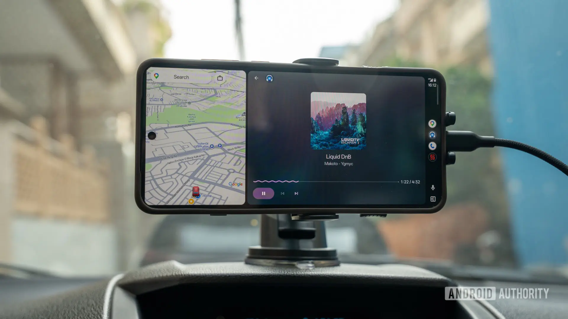
For years, Android Auto has been a reliable but visually conservative companion for drivers. Its interface prioritized function over flair, with dark backgrounds, flat tiles, and a utilitarian layout that some critics argued felt dated compared to Apple CarPlay's more polished aesthetic. That perception is about to change. Google has already confirmed that a major Android Auto redesign is in the works, featuring more fluid elements, fewer rigid shapes, widget support, and eventually even video playback. The new icon is the first concrete step in that direction, arriving ahead of the larger interface refresh.
A new color for a new era
The most obvious change in the updated icon is the shift from blue to green. Blue has been the dominant color of Android Auto since its debut, linking it visually to the broader Android brand. But green carries its own associations. The specific shade used in the new icon closely resembles the green of the Android bugdroid, the little robot mascot that has represented the platform since 2008. This choice may signal a return to Android's roots, a more playful and approachable identity as the platform expands into new vehicle types and use cases.
There is also a practical interpretation: green is universally associated with electric vehicles, eco-friendly transportation, and sustainability. As Android Auto becomes more deeply integrated into electric cars from automakers like Ford, General Motors, and Rivian, a greener icon could subtly reflect the transition to cleaner mobility. Whether intentional or not, the color shift aligns with the broader automotive industry's move toward electrification.
Rounder corners and refined details
Beyond the color, the new icon makes several subtle design changes. The corners are noticeably rounder than before, both on the outer shape and on the upward arrow that resembles a paper airplane. The spacing between the green and white elements has also been increased, giving the icon a lighter, more breathable appearance. The shadows are largely unchanged, but the overall effect is softer and more modern.
These tweaks align with Google's recent design language across its apps and services. The company has been gradually moving away from sharp corners and dense layouts in favor of rounded shapes, generous padding, and calm visual hierarchy. Android Auto's new icon fits that trend, even as it stands apart from some other Google apps that use gradients. Google appears to have opted for a solid green color rather than a gradient finish, which keeps the icon distinctive and easily recognizable at small sizes on a car's infotainment display.
A stepping stone to the redesign
The icon update is not accompanied by any functional changes in version 17.6.663424. There are no new menus, settings, or features tied to this release. But the icon serves as a preview of the larger redesign that Google has promised. The company has already outlined a new Android Auto interface that prioritizes natural interactions, intelligent suggestions, and deeper integration with Google's AI services, including the Gemini assistant.
One of the most anticipated additions is support for widgets, which would allow drivers to customize their home screen with glanceable information such as weather, calendar events, news, or smart home controls. Another major change is the introduction of video playback, a feature that has been available in some rival platforms but has been notably absent from Android Auto. Google has not announced a precise rollout date for the redesign, but progress on hardware launches and software milestones suggests that the company is shifting its focus to the user experience.
There have been reports about a device referred to as the Googlebook, which may have absorbed some of Google's engineering resources. With that hardware launch presumably nearing completion, Google can now pour more energy into fulfilling its software promises. The arrival of the new icon suggests that the redesign is moving from concept to execution.
Why the icon matters
Some users may dismiss an icon change as trivial, but app icons are a powerful form of brand communication. They are the first thing users see on their home screens and in app drawers, and they set expectations for the experience inside. A shift from blue to green could be Google's way of telling users that Android Auto is entering a new phase, one that is more integrated, more intelligent, and more aligned with the future of driving.
Historically, Android Auto has been available in a limited number of countries and vehicles, and its development has been tightly linked to the growth of Android Automotive OS, the full operating system that runs on a car's infotainment hardware. Android Auto acts as a projection system, mirroring selected apps from a phone to the car's display. Over time, Google has expanded Android Auto's capabilities to include navigation, media, messaging, and a growing list of third-party apps. The visual redesign promises to make those capabilities easier to access and more pleasant to use.
Rollout expectations
As with most Google updates, the new icon is not appearing for everyone at once. Only a small number of users currently see it, which is typical for a staged rollout. The update will likely reach more devices progressively over the coming days and weeks. Users who are eager to see the new icon can check for updates to the Android Auto app through the Google Play Store or sideload the latest APK, though the latter approach carries some risk and is not recommended for most users.
Once the icon is widely available, it will serve as a reminder that the big redesign is still coming. In the meantime, Google is likely to continue refining its in-car experience behind the scenes. The company has not provided a detailed timeline for the interface overhaul, but the pace of development appears to be accelerating.
For now, the new icon is a small but telling glimpse of what lies ahead. It reflects a more modern, approachable, and future-oriented Android Auto. The shift from blue to green may be subtle, but it signals a departure from the old and an embrace of the new. As Android Auto moves toward a broader redesign, users can expect more changes that will make the platform feel fresher, more responsive, and more in tune with the way people drive today.
Source: Android Authority News